State Bank

Digital Banking Platform · Fintech App · Next-Gen UX

State Bank was a strategic UX initiative to help a leading public bank in southern Brazil reconnect with a younger, digitally-driven generation. The goal? Redesign their product offering to be more relevant, intuitive, and engaging for new users entering the financial world.

I joined this project as part of a multidisciplinary team — including UX researchers, a data analyst, and a marketing strategist — to lead user experience design and ensure our solutions were grounded in real user behavior and expectations.

This was more than a visual redesign. It required:

  • Identifying how a traditional bank could speak the language of Gen Z and Millennials.

  • Reframing banking products to feel more personalized and rewarding.

  • Validating every new concept through interviews, user flows, and prototype testing.

  • Aligning data, business goals, and design to deliver a product with long-term adoption potential.

We transformed insights into action — improving engagement, strengthening brand perception, and successfully helping the bank renew its customer base for the next generation of users.

Note: For confidentiality reasons, interface and images details are shown in low resolution.

Client

A leading state bank in Brazil (Confidential)

Role

Senior User Research and Product Strategy

duration

4 months (2024)

location

South of Brazil (Remote)

Skills

User Research, AI Researcher, Data Analysis and Synthesis, Prototyping and Testing, Strategic Planning and Execution & Cross-functional Collaboration

Challenge prompt

Redesign the banking experience to attract and retain younger users — transforming outdated financial products into a modern, intuitive, and emotionally resonant digital experience for a new generation.

Objectives

Our goal was to help this state-owned bank reconnect with a younger, digitally-savvy audience. To achieve that, we:

  • Conducted in-depth market analysis and user interviews to uncover behavioral patterns and unmet expectations.

  • Collaborated with stakeholders to reframe outdated financial products into experiences that resonate with new generations.

  • Refined the bank’s offerings through concept testing and validation, aligning them with the real needs and values of younger users.

By grounding every decision in data and user insights, we worked to renew the bank’s customer base and position it as a relevant player in a rapidly evolving financial landscape.

1. The Initial Challenge

I was tasked with designing the experience for a product that didn’t yet exist. All we had were loose ideas and the need to create something from scratch — something intuitive, trustworthy, and scalable.

We synthesized all early research into a visual report to align expectations with the client. This included an overview of the bank’s current positioning, market gaps, and a breakdown of generational product mismatches — setting the stage for strategic design decisions.

2. Research & Immersion

We began by immersing ourselves in the bank’s current reality and market context. We aimed to understand generational differences in financial behavior, particularly what younger users expected from a digital banking experience. To uncover these insights, we:

Conducted generational research to map out motivations, frustrations, and digital maturity across Baby Boomers, Gen X, Y, and Z.

Held discovery interviews and surveys with real users to identify unmet needs and usage gaps.

Analyzed existing products to pinpoint areas of friction and misalignment with younger user expectations.

We also ran a series of stakeholder workshops to align around business objectives, competitive positioning, and potential opportunity spaces. From this, we identified 15 key insights that would shape the rest of the design process.

Generational Empathy Map: Based on the insights obtained from the comprehensive analysis, we developed much more specific empathy maps for each generational subgroup. These maps delve into granular details for each subgroup, providing an even richer and more detailed understanding of their experiences and needs, as well as insights focused on the development of digital products/services.

This phase laid the strategic foundation for everything that followed, ensuring our solutions would not only meet user needs but also position the bank for future growth in the digital era.

3. Conceptualization & Design Strategy

We moved from research insights to concrete design direction by first aligning our team and stakeholders around a shared product vision.

These pillars turned user insights into actionable design direction:

Insights → Strategy

  • Clarified what Gen Z expects from digital

  • Mapped emotional/functional goals from empathy work

  • Aligned product vision via workshops

Core Design Principles

  • Simplicity over complexity: Remove friction across all touchpoints.

  • Empathy in communication: Reflect language and tone that feels human and relevant.

  • Transparency builds trust: Make key actions (like balances, fees, and limitations) clear by design.

Setting the Foundation

  • Prioritized flows: Join, Navigate, Engage

  • Drafted navigation and IA from real behavior

  • Defined scalable patterns for a design system

4. Prototyping & Iteration

With limited time and the need for fast alignment, we moved directly into mid- to high-fidelity prototyping. These interactive screens helped us communicate ideas clearly and accelerate internal validation — especially in a project that demanded speed and clarity.

💡We concentrated on creating realistic experiences for key features, including a personalized financial dashboard, interfaces for goal and spending tracking, and updated processes for payments and account overviews.

But while we were gaining momentum, a national emergency changed everything.

⚠️Emergency Disruption: Historic Floods in Rio Grande do Sul (2024)

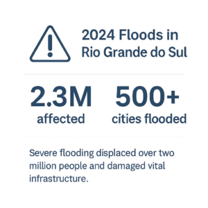
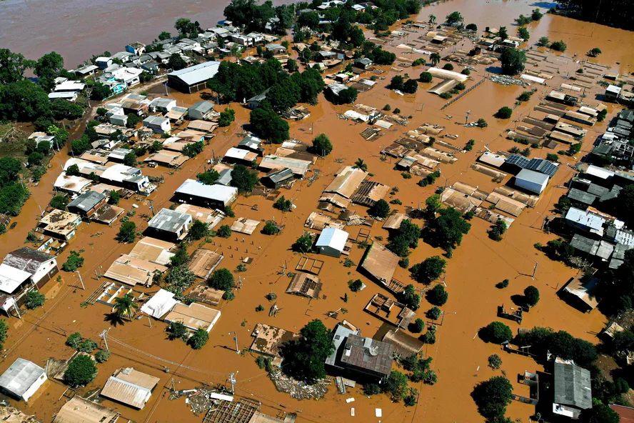
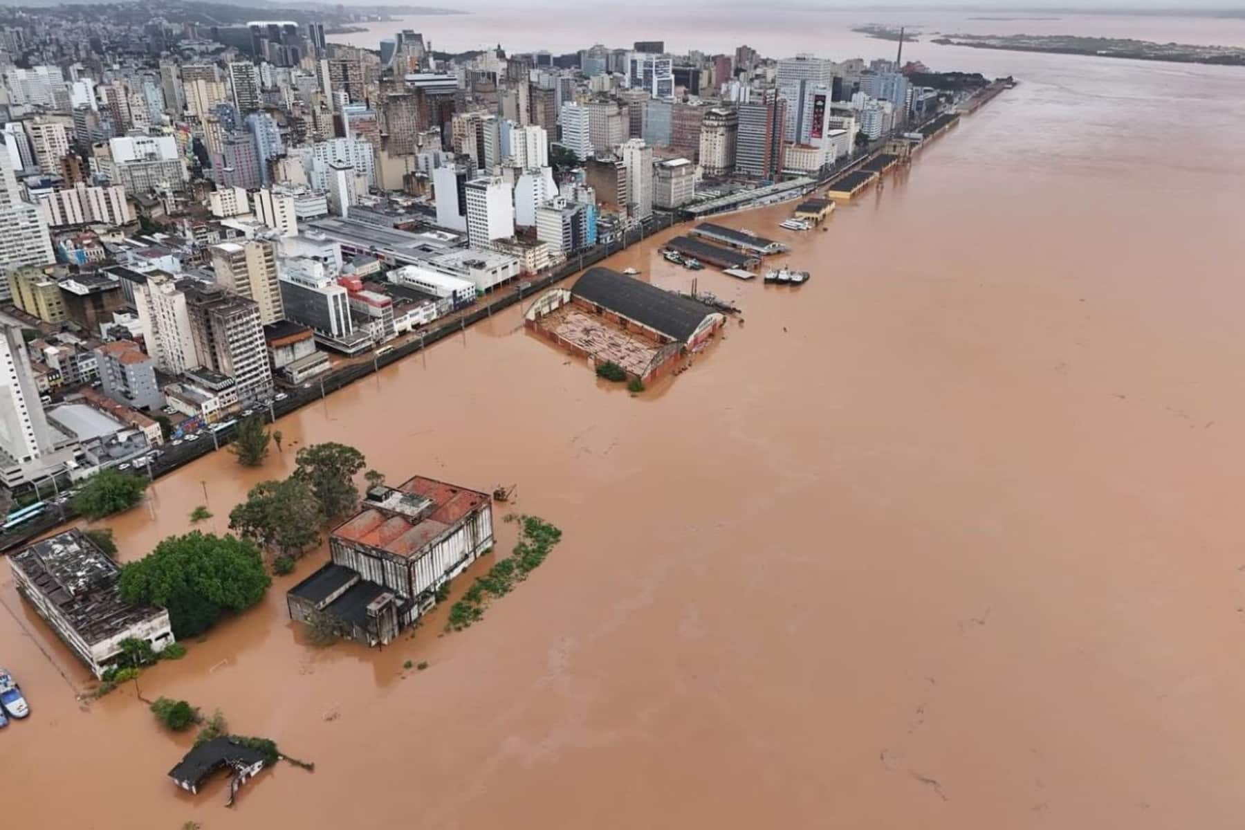
In May 2024, the state of Rio Grande do Sul faced one of the most devastating natural disasters in Brazilian history. Catastrophic flooding displaced over 2 million people, destroyed vital infrastructure, and left cities under water for weeks.


As the bank is a public institution rooted in the region, its entire operational focus shifted to emergency relief, recovery, and support for affected communities. In light of this, the project was officially suspended indefinitely.

“In times of collective crisis, design must take a back seat — so that people, safety, and resilience can come first.”

This abrupt and painful interruption not only prevented further iterations and testing but also reframed our understanding of user priorities. In a post-crisis landscape, financial tools must be more than convenient — they must be compassionate, resilient, and accessible.

5. Final Design

Despite the project's early interruption, we delivered a complete set of mid-to-high fidelity mobile prototypes that reflected the strategic insights gathered during the discovery and conceptualization phases. Our goal was to create an experience that would feel modern, humanized, and engaging for younger users, without compromising on clarity and trust — core pillars of financial design.

Current University Account Journey: The original journey reflects the existing experience offered to university students. It served as a baseline for identifying complexity and redesigning a more intuitive, goal-oriented path.
Youth Account Journey (Mesada): This flow was designed for younger users and parents managing allowances. It includes guided onboarding, user creation, and secure account linking — balancing autonomy with parental control.
Refined University Journey: We proposed a streamlined version of the onboarding flow for university students — eliminating redundant steps and optimizing navigation to improve completion rate and reduce cognitive load.

6. Results & Impact

Although the project was paused before implementation, we delivered significant value across strategy, research, and design. In a short but intense timeframe, we built a foundation that can be resumed or repurposed when conditions allow.

✅ What We Achieved Before the Interruption: 

  • End-to-end mapped journeys for three user segments: youth, student, and standard accounts

  • Mid-to-high fidelity prototypes, built with speed and accuracy to communicate design intent under tight deadlines

  • A complete UX strategy playbook, rooted in user research, business needs, and behavioral insights

These deliverables remain accessible as a restart point for future development or internal experimentation — grounded in research, aligned to users, and adaptable to new contexts.

What We Delivered:
🎯Discovery & Research:
  • Generational Mapping – Behavioral patterns across Gen Z, Millennials, Gen X

  • Desk Research & Benchmarking – Market trends, competitive analysis, and opportunity spaces

  • User Surveys & Cluster Analysis – Segmented insights from quantitative data

  • Social Listening – Perception mapping based on real online conversations

  • Focus Group Highlights – Qualitative feedback from representative users

🛠️ Strategic Outputs:
  • Value Proposition Canvases

  • Feature Prioritization Boards

  • Personas & Empathy Maps

  • Content Strategy Boards

  • Final Mid–High Fidelity Prototype (mobile-first)

This snapshot showcases the breadth of research artifacts we delivered — including generational mapping, benchmarking, surveys, clustering, and focus group insights. These assets grounded the design strategy in real user behavior and market context, and remain available to guide future iterations when the project resumes.

7. Learnings & Reflections

This project wasn’t just about designing banking experiences — it was about learning how to adapt, align, and build value even under unexpected and challenging circumstances.

🧠 What I Learned as a Designer:

  • Speed can coexist with strategy: With no time for low-fidelity drafts, I learned how to make bold design decisions with clarity — without sacrificing intent.

  • Clarity and alignment are as important as pixels: Designing for real users also means designing for teams — and being clear in workshops, flows, and storytelling is as vital as the UI itself.

  • Design is not always linear: Sometimes, the journey ends before the delivery. And that’s still part of the process.

🌍 What I Learned as a Person:

  • Empathy must extend beyond the screen: Witnessing the floods in Rio Grande do Sul reminded me that users are not just personas — they are people, families, communities.

  • Pause can be part of progress: Knowing when to stop — and how to preserve good work for the future — is part of being a responsible, strategic professional.

  • Collaboration matters most when things change: Stakeholder trust and team synergy were key to making progress fast, and to protecting the work when the project was suspended.

“A good design solves problems. A great design remains relevant — even when the world shifts beneath it.”

This project left me more resilient, more focused, and more convinced that design is not just about building products — it’s about building value, responsibly.

Other Projects

Magalu Cloud

Leading a multifaceted team to design, develop, and launch foundational cloud services and a corporate website, setting new standards in the Brazilian tech sector.

Global Personal Care Cosmetics Group

A 15-month UX overhaul for a global cosmetic leader, focusing on user-centered solutions, aligning stakeholders, and addressing key pain points for a seamless digital experience.

Game Sports Prediction

A nine-month UX initiative to build a digital sports prediction platform from scratch. I led the product architecture, user flows, and design system, turning raw ideas into a gamified experience validated by real users and delivered across mobile and web